Styling Foundation
When every screen writes its own colors (#ff493b here, a red utility class there), changing the brand or adding a dark theme means hunting down each one. Akan avoids that by naming colors for what they are for, and letting every screen use the names.
Akan uses Tailwind CSS with a semantic design-token layer and the akanjs/ui primitives as the default styling foundation. So app screens say primary, background, warning or destructive instead of hard-coding every color. The two halves split the work like this:
Tailwind CSS
Structure and layout
A fast utility language for layout, spacing, responsive behavior and one-off composition. Tailwind CSS
flex gap-4 p-4 md:grid-cols-2Tokens + akanjs/ui
Theme-aware colors and components
Semantic color names and primitives (Button, Badge, Input, Field …) that follow the theme.
bg-primary text-foreground <Button>Words used on this page
TermDescription
semantic token
A color named for its role (primary, background, destructive) instead of its value.
theme
One set of values for every token. The data-theme attribute picks which set applies.
primitive
A ready-made akanjs/ui component (Button, Input, Badge, Field) that already uses the tokens.
custom property
A CSS variable such as --primary. Tokens are custom properties underneath.
How the layers work together
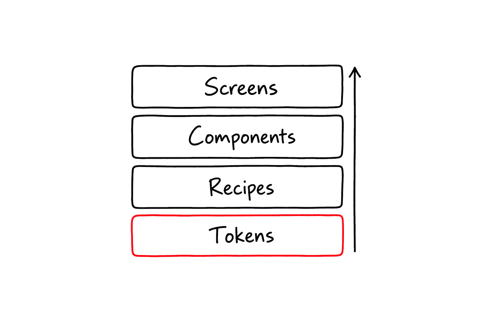
LayerWhat it does
tokens
Brand decisions turned into names such as primary, background, warning and destructive.
recipes
Functions that compose token classes into one named look, such as buttonRecipe.
components
akanjs/ui primitives (Button, Input, Badge) and Tailwind utilities that use those names.
screens
Business screens assembled from components, without repeating raw color and spacing rules.
Tokens are declared in page/styles.css, which also imports Tailwind and the Akan UI styles. The Theme System section below shows that file; the UI Recipe page covers the recipe layer.
Design System First
A page designed from scratch drifts: its buttons end up a little rounder, its borders a little lighter than the page next to it. So define the app's basic component style first, and let pages only assemble those components.
- Buttons, inputs, cards, forms, alerts, tabs, modals and navigation share the same spacing, radius, text color, border and state behavior, through shared classes.
- Business pages assemble the design system instead of redefining colors and spacing.
- Imported modules feel consistent too, because they use the same Tailwind and semantic design tokens.
A block built this way uses no color values at all, only token names and recipes:
Switch the theme and the whole block restyles itself, because every class in it points at a token rather than a color.
Theme System Declaration
Components write bg-primary once. Which red that means is decided in a single file, the app style entry, once per theme. Declaring it takes four steps:
- Import Tailwind and the Akan UI styles.
- Define the raw values per theme as CSS variables under :root and [data-theme].
- Map those variables to Tailwind color names with @theme inline.
- Switch themes by changing the data-theme attribute. Nothing else changes.
apps/myapp/page/styles.css
A color that text sits on comes with a -foreground partner for that text: bg-primary pairs with text-primary-foreground, so a label on a primary button stays readable in every theme.


Because @theme inline references var(), the same class (bg-primary, text-foreground …) resolves to a different color per data-theme. One app can define light, dark, brand or admin themes without changing any component class.
Lib-Owned Tokens
Some colors must not follow the theme. A Kakao sign-in button is Kakao yellow in the light theme and in the dark one. When a lib's components need fixed colors like that, the lib declares them itself:
Theme tokens
Follow the theme
Declared in the app's page/styles.css and mapped with @theme inline.
bg-primaryLib tokens
Fixed in every theme
Declared once in libs/<lib>/ui/tokens.css as plain custom properties.
bg-[var(--kakao)]Every app whose pages reach that lib picks the file up automatically, ahead of its own stylesheets, so the app still has the last word on any variable both declare. Nothing is imported by hand, and a new app cannot forget it.
libs/social/ui/tokens.css
libs/social/ui/KakaoButton.tsx
Why not a Tailwind @theme extension? The color vocabulary is closed per stylesheet, so bg-kakao would generate no CSS. Reference the variable as bg-[var(--kakao)], a form the color lint rules allow on purpose.
Font Declaration
Fonts are declared once, in the root layout, and then used like any other Tailwind class. Hand the .fonts() stage of the rootLayout() chain an array; each entry takes three fields:
FieldDescription
name
The font's name. It becomes the class font-<name>, such as font-pretendard.
paths
One entry per font file: its src and the weight it covers.
default
The font the whole app uses when no font class is set. Only one font can be the default.
apps/myapp/page/_layout.tsx
Each name is now a class. Text without one uses the default font, Pretendard here:
Using font classes